Pixel art background layers and parallax scrolling in code
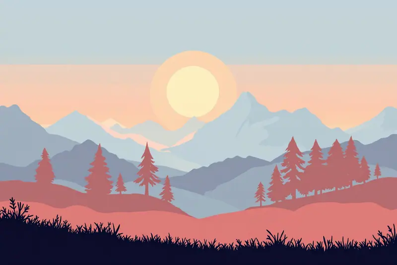
A good pixel art background does two jobs that pull against each other. It has to make the world feel big and deep, and it has to stay out of the way so the player can always see the character, the enemies and the platforms. Most of the craft is in balancing those two. Parallax, where distant layers scroll more slowly than near ones, adds the depth almost for free once the layers are painted well. This piece covers painting the layers, making them tile, choosing parallax factors, and the few lines of code that scroll them.
Everything here assumes the game draws at a fixed low resolution and scales by whole numbers. If yours does not yet, the pixel art camera piece explains the setup, and parallax will look much cleaner with it in place.
Depth with value and saturation
In real air, distant things lose contrast and colour. They get lighter (on a clear day) and drift towards the colour of the sky. Painters call this atmospheric perspective, and it is the strongest depth cue you have in a flat 2D image.
For a pixel background, translate it into three rules per layer:
- Further layers are closer in value to the sky.
- Further layers are less saturated.
- Further layers have less internal contrast, often only one or two colours.
Here is the layer plan for a simple daytime forest scene, using a sky of pale blue:
| Layer | Content | Colours | Value vs sky | Saturation |
|---|---|---|---|---|
| 0 | Sky gradient | 3 bands | n/a | low |
| 1 | Far mountains | 1 to 2 | very close | very low |
| 2 | Hills with pines | 2 | a bit darker | low |
| 3 | Near trees | 3 | clearly darker | medium |
| 4 | Gameplay layer | full ramps | full range | full |
| 5 | Foreground grass | 2 | darkest | medium |
The gameplay layer gets the full range: the darkest darks, the brightest lights, the strongest colours. That is where the player looks, so that is where contrast belongs. A common mistake is to paint a gorgeous detailed far layer with high contrast, which then pulls the eye away from the action and makes the platforms hard to read.
A quick test is to desaturate a screenshot and squint. The gameplay layer should jump out; the background layers should form soft bands that get lighter as they recede.
Building the layer palette
The easy way to get consistent layers is to build them from the sky colour. Take each layer's base colour and mix it towards the sky by a fixed amount: the far mountains might be 75 percent sky, the hills 50 percent, the near trees 25 percent. You can do the mixing by eye in the editor, or compute starting values and adjust from there.
/// Mix two sRGB colours by t (0.0 keeps a, 1.0 gives b). Good enough for picking palette entries.
fn mix(a: [u8; 3], b: [u8; 3], t: f32) -> [u8; 3] {
    let f = |x: u8, y: u8| (x as f32 + (y as f32 - x as f32) * t).round() as u8;
    [f(a[0], b[0]), f(a[1], b[1]), f(a[2], b[2])]
}

fn main() {
    let sky = [0xb8, 0xd8, 0xe8];
    let pine = [0x2f, 0x4f, 0x3a];
    for (name, t) in [("near", 0.25), ("hills", 0.5), ("far", 0.75)] {
        let c = mix(pine, sky, t);
        println!("{name}: #{:02x}{:02x}{:02x}", c[0], c[1], c[2]);
    }
}
This mixes in sRGB space, which is not physically correct, but for picking a handful of palette entries that you will tweak by hand anyway it works well. Once you have the values, adjust the hue a little: distant layers in a warm sunset scene can lean towards peach or lilac, which a straight mix will not give you. The palette ramp habits from making pixel art apply here too: shift hue, not only value.
Shapes that read as distance
Distant layers should be simpler, not just paler. Far mountains are one or two big shapes with a clean top edge. Hills have rounded tops and a few tree tips poking out. Near trees get trunks, branches and clusters of leaves. As layers come closer, the shapes get smaller relative to the layer, more numerous and more detailed.
Pay attention to the top edge of each layer. That edge against the layer behind it is most of what the player sees, especially while scrolling. A good edge has variety in rhythm: a tall peak, a few small bumps, a wide flat stretch. A regular zigzag looks like wallpaper, and the repetition becomes obvious as soon as it scrolls.
Leave the bottom of far layers plain. They will be covered by nearer layers most of the time, and plain areas keep the file small and the eye calm.
Making layers tile horizontally
Background layers usually repeat sideways. To make a layer tile, its left and right edges have to match: the pixel column at x = 0 should continue naturally from the column at the far right.
Most pixel editors have a tiling or wrap preview that shows copies of the canvas side by side. Turn it on and paint the seam directly. If yours does not, shift the canvas by half its width with a wrap offset, fix the seam that is now in the middle, and shift back.
How wide should each layer be? Wider means less visible repetition and more painting. A practical set of widths for a 320 by 180 game:
| Layer | Width | Repeats visible at once | Notes |
|---|---|---|---|
| Far mountains | 320 | 1 | moves slowly, repetition rarely noticed |
| Hills | 480 | under 1 | a little extra width hides the repeat |
| Near trees | 256 | over 1 | moves fast, detail hides repetition |
| Foreground grass | 128 | 2 to 3 | small and fast, repeats are fine |
Near layers can be narrow because they move quickly and the eye cannot track the repeat. The far layer is the one most likely to show an obvious pattern, because the player watches it for a long time, so one distinctive feature, a lone tall peak, should appear only once per repeat.
Parallax factors
Parallax means each layer moves by a fraction of the camera's movement. A factor of 1.0 moves exactly with the world (the gameplay layer). A factor of 0.0 never moves (the sky). Values in between give depth, and values above 1.0 make a layer move faster than the world, which reads as being in front of the gameplay.
A starting table for a side-scroller:
| Layer | Factor x | Factor y | Camera moves 100 px, layer moves |
|---|---|---|---|
| Sky | 0.0 | 0.0 | 0 px |
| Far mountains | 0.1 | 0.05 | 10 px |
| Hills | 0.3 | 0.15 | 30 px |
| Near trees | 0.6 | 0.4 | 60 px |
| Gameplay | 1.0 | 1.0 | 100 px |
| Foreground grass | 1.3 | 1.0 | 130 px |
Vertical factors are usually smaller than horizontal ones, or zero for the far layers. If the camera follows a jump, a far layer moving vertically at full speed makes the horizon bounce, which looks odd and can feel slightly queasy. Many games lock far layers vertically and let only the near ones follow.
The ratios between layers matter more than the exact values. Spacing them roughly geometrically, each about double the one behind it, feels natural.
Scrolling the layers in code
Each layer's offset is the camera position times its factor. To tile, wrap that offset by the layer width and draw the layer enough times to cover the screen. Here is an engine-agnostic sketch:
struct Layer { width: i32, factor: (f32, f32), base_y: i32 }

/// Returns the x positions (in target pixels) where copies of the layer should be drawn.
fn layer_copies(layer: &Layer, cam_x: f32, screen_w: i32) -> Vec<i32> {
    // Round after multiplying, so the layer moves in whole pixels.
    let offset = (cam_x * layer.factor.0).round() as i32;
    let start = -offset.rem_euclid(layer.width);
    let mut xs = Vec::new();
    let mut x = start;
    while x < screen_w {
        xs.push(x);
        x += layer.width;
    }
    xs
}
rem_euclid keeps the remainder positive when the camera moves into negative coordinates, which a plain % would not. The result is a list of x positions, usually one to three per layer, where you draw the layer's texture. The y position is layer.base_y - (cam_y * layer.factor.1).round() as i32, computed the same way.
The alternative is to set the texture's sampler to repeat and draw one screen sized quad with scrolled texture coordinates. That is a single draw call per layer and needs no loop. Both approaches are fine. The quad method needs the texture width to divide evenly into the scroll if you want whole pixel steps, which works naturally when you compute the offset in pixels and divide by the width at the end.
Rounding and the jitter between layers
Parallax layers each round their offset separately, so at slow camera speeds they step at different moments. One layer moves a pixel this frame, another next frame. At low factors this is mostly invisible. Where it becomes visible is when two layers overlap closely, such as the near trees and a foreground bush, and you see them slide against each other in an uneven rhythm.
Two things help. Keep factors on simple fractions (0.25, 0.5, 0.75) so the steps line up more often. And if the camera supports smooth subpixel scrolling of the whole image, apply the same treatment to each layer: snap inside the low resolution target and shift by the fractional remainder at screen resolution, as described in the camera piece. Rounding late, just before drawing, matters more than any of these. Never accumulate rounded offsets across frames.
Keeping the character readable
After all the layers are in, put the hero in front and look again. The character should be the highest contrast object on screen. If it sinks into the near trees, the near layer is too dark or too saturated. Pull it towards the sky colour another step.
Outline colour helps too. A character with a dark outline needs mid tone backgrounds behind it, not near-black ones. The character sprite piece suggests keeping the hero more saturated than everything behind it, and parallax backgrounds are where that rule earns its keep.
Questions people ask
How many parallax layers do I need?
Three background layers plus the gameplay layer is a comfortable minimum for a convincing sense of depth. More than five rarely adds much and costs fill rate and painting time.
Should backgrounds use the same palette as the sprites?
Share the sky and a few key colours so the scene feels unified, but give backgrounds their own desaturated ramps. A fully shared palette tends to make backgrounds too strong.
Can I use a gradient for the sky?
Yes, but use a few flat bands rather than a smooth gradient. Bands of 3 to 5 colours look like pixel art; a smooth gradient looks like a different art style pasted behind it.
Try it
Paint four layers at 320 pixels wide using only the sky colour and one tree green mixed at 0, 25, 50 and 75 percent. No other colours. Scroll them with the factor table above at a slow walking speed and watch for the furthest layer's repeat. If you can spot where it loops within ten seconds, add one distinctive shape to that layer and try again.
Filed in 2D Craft · Graphics & Shaders

Written by Jun Takemura
Jun draws and animates pixel art and writes about the craft side of 2D games: sprites, tiles, palettes, animation and the small design choices that make a game feel finished. Lives in Osaka and never misses a jam weekend.